
Floor & Facility Graphics That Last: Anti-Slip, Forklifts, and Safety Lines (2025 Guide)
Introduction
“Safety doesn’t happen by accident.” I keep that line taped to the inside of my notebook because it’s true in busy facilities where floor graphics do real work. They guide people, separate hazards, and keep traffic moving, and then forklifts, pallet jacks, auto-scrubbers, oils, and winter grit try to destroy them. Some markings fail in a week. Others hold up for years. The difference isn’t luck; it’s choosing the right materials, prepping the surface, and installing with a plan that fits the environment.
In this guide, I’ll show you how to create floor and facility graphics that last with anti-slip texture, forklift-resistant durability, and safety lines that stay visible. We’ll talk DCOF and ANSI references, high-tack adhesives, textured overlaminates, edge-lift prevention, and the small habits that make a big difference. I’ve made mistakes (plenty) and learned fix-it tricks the hard way. You don’t need to. Let’s build something tough, clear, and safe!
What “Durable” Really Means for Floor & Facility Graphics
Durability is not one thing; it’s a bundle of performance traits working together. When I spec floor graphics now, I define durability across adhesion strength, abrasion resistance, chemical resistance, slip resistance (COF/DCOF), UV stability, and edge integrity. If one of those legs is weak, the whole stool wobbles. A graphic might bond beautifully but scuff fast under Taber abrasion. Or it resists scuffs but loses anti-slip texture after a month of auto-scrubbing. Durable means balanced.
Start by matching environment to expectation. Foot-traffic corridors and office lobbies need one thing; forklift wheel paths, staging lanes, and dock approaches need another. Heavy pallet jack traffic causes point loading and shear that pry edges up. In a freezer, adhesive gets stiff, and low temps rob you of tack. In a washdown room, chemicals and hot water soften inks and laminates. Durable means you’ve anticipated that specific mix.
It also helps to name the most common failure modes: edge-lift, scuffing, delamination, discoloration, texture flattening, and ink abrasion. I once watched a perfect-looking installation start curling at the corners in week two. The material wasn’t the villain, the spec ignored turning radii where forklift wheels “grind” the same edge dozens of times a day. We radius corners now and keep edges out of high-shear arcs. Simple change. Big payoff.
Set KPIs up front. For example: “Minimum 12-month service life in forklift aisles; maintain DCOF ≥ 0.42 wet; no more than 10% edge fray at 9 months; withstand daily auto-scrubbing with neutral pH cleaners.” It sounds formal, I know, but those targets help you judge success fairly. And because slip resistance is safety-critical, plan periodic COF/DCOF checks with a documented inspection interval. Not complicated. Just consistent.
Finally, durability includes clarity. If the message is scuffed to a gray blur, it’s functionally failed even if adhesion is fine. Choose overlaminates that protect both texture and legibility. A durable graphic is the one that still does its job when you’re busy and not looking. That’s the benchmark.
Surface & Substrate: The #1 Predictor of Success
If I could only fix one variable, I’d choose the substrate every time. The floor under your graphic is the true boss. Sealed/epoxy concrete, polished concrete, VCT/LVT, quarry tile with grout lines, sealed wood, even coated steel plates, each behaves differently with adhesives. Porosity, moisture, and contamination drive outcomes more than brand names on boxes.
Start with moisture. Concrete looks dry but can be breathing out water vapor for months. Check MVER/RH (moisture vapor emission rate / relative humidity) and respect cure times and sealer recommendations. High moisture pushes against adhesive, and the bond eventually gives up, usually at edges first. In borderline cases, a primer/adhesion promoter can help, but it’s not a band-aid for soaked slabs.
Then tackle contamination control. Degrease thoroughly (forklift aisles collect oils, silicone from tire dressings, and winter salts). I prefer a two-stage clean: a strong degreaser, an agitation pass, a clean water rinse, and ample dry time. If you can, lightly abrade/etch glossy coatings to improve mechanical grip, then remove dust. Waxes and floor finishes complicate adhesion. Sometimes the right move is to strip or seal first for a known, consistent surface.
Compatibility matters. I’ve seen vinyls lift on ultra-low surface energy (LSE) coatings where only an LSE-tuned adhesive would do. Polished concrete is slick and beautiful, and a challenge for bond. Tile and grout add uneven support: edges that live over grout lines get flexed and stressed by load. In those areas, consider wider radiuses, thicker films, or shifting the layout a few inches to ride solid tile.
Temperature is the quiet saboteur. Many adhesives have a minimum install temperature; if the substrate is cold, tack starts weak and never recovers. Warm the floor (safely), schedule installs midday, or use materials rated for colder application. Humidity can also condense at dew point and leave a thin water film you can’t see. I learned to check dew point on “perfect” days after one install mysteriously bubbled.
Bottom line: the best material on the wrong surface will still fail. Document the floor type, porosity, moisture, contaminants, and temperature before you spec. If anything’s uncertain, run a pilot patch in the worst-case spot and abuse it for a week. Floors tell the truth if you listen.
Materials that Survive Forklifts (Films, Overlaminates, Thickness)
“Will it survive forklifts?” lives in my head when I open a catalog. Start with the base film. PVC is common and cost-effective; PET and polycarbonate bring higher abrasion resistance and dimensional stability. The thicker the stack (film + adhesive + overlaminate), the better it resists point loads and scuffing, but thickness alone isn’t the hero, texture and chemistry matter more.
For true traffic zones, choose a textured, anti-slip overlaminate designed for floors. There are two major families: micro-textured (easier to keep clean, kinder to print clarity) and grit (higher bite, sometimes harsher on mops and slightly dulls fine details). Aim to retain DCOF while preserving legibility. I’ve had wins with micro-texture in pedestrian areas and grit near wet entries and ramps. Match texture to the environment, not vanity.
Inks and curing matter too. UV-cured inks typically have strong scratch resistance and solvent resistance, though solvent/latex can be excellent with a good laminate. Do a quick ink anchorage check, rub aggressively after a full cure; if color transfers, rethink the stack. Premature lamination can trap solvents and lead to bubbles later (a mistake I made once, only once).
Edges are where shear happens, so design them to survive. Use rounded corners (I like at least 0.25" radius; more for forklift lanes). Avoid sharp points. In high-shear zones, a beveled edge overlaminate or a thin edge sealant can stop “peel-up” from starting. And keep critical edges out of turning arcs. If a wheel can find a corner, it will.
Adhesive type is the silent partner. High-tack adhesives bond to sealed and slightly irregular surfaces, while LSE-tuned adhesives handle tricky coatings. If removability matters (temporary 5S) pick a removable adhesive but understand it trades some ultimate strength. For freezers or cold rooms, look for cold-temperature adhesives that still wet-out at low install temps.
Finally, remember thickness is both comfort and risk. Thick stacks feel premium and resist scuffs, but a tall edge can catch more easily. I balance this by using thicker constructions in the center with strong texture, then designing radiused shapes and smart placement to keep edges safe. Forklifts are tough, but a smart spec is tougher.
Anti-Slip Compliance & Testing (COF/DCOF Standards)
Slip resistance isn’t a nice-to-have; it’s life and limb. That’s why I treat COF/DCOF like I treat brakes on a car. You’ll hear two families of measures: static COF (how hard it is to start moving) and dynamic COF (how hard it is to keep from sliding once in motion). Many facilities target DCOF because it reflects real walking conditions, especially wet.
Common references include ANSI A326.3 for DCOF, NFSI B101.1/B101.3, and European DIN 51130 (the “R-ratings”) or pendulum testing methods. I don’t get religious about one standard over another. I get practical. What rating corresponds to your actual conditions, dry corridors, wet entries, ramps, washdown areas, cold rooms? If you choose a texture that hits your target on day one but polishes smooth after a month of auto-scrubbing, you didn’t buy safety; you rented it.
Here’s a routine that works. First, spec a textured overlaminate with tested DCOF values for wet and dry. Second, confirm a cleaning plan that preserves texture: neutral pH cleaners for routine work, and avoid aggressive pads that act like sandpaper. Third, create a re-testing cadence. Quarterly is common where risk is high. Semiannual in calmer areas. Log the results. If the DCOF drifts below target, act, clean differently, replace, or move to a grippier texture.
I learned this lesson in a lobby that looked spotless but became slick after a new disinfectant. The chemistry left a faint residue that filled the micro-texture. The fix wasn’t a harsher pad; it was a rinse step and a compatible cleaner. Slip resistance returned, and the team stopped holding their breath on rainy days.
Keep signage honest, too. If an area is temporarily wet after cleaning, mark it until dry. Safety lines and icons communicate risk quickly, but they only help if the floor under them stays anti-slip. You can even add photoluminescent accents for low-light egress paths, in some settings, that extra guidance matters when power blinks.
Build anti-slip into your spec, into your cleaning SOP, and into your inspections. That’s how you protect people and stay compliant without playing standards bingo.
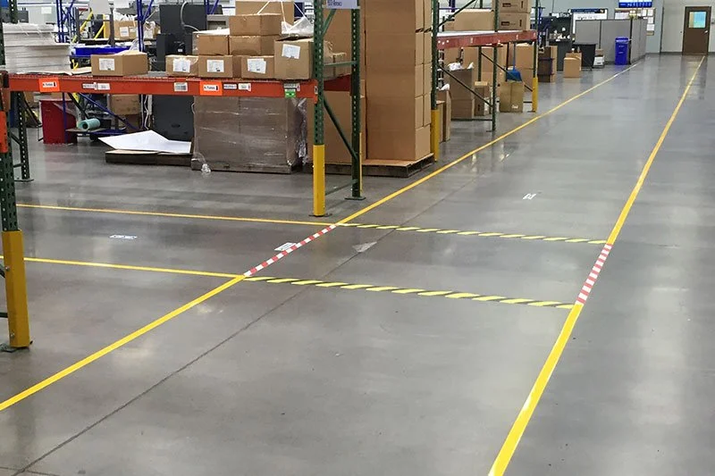
Safety Lines & Zone Markings: Paint vs. Tape vs. Graphics
Choosing between paint, tape, and graphics is like choosing a vehicle each has a job. Paint is permanent-ish, excellent for large base stripes and areas where you can afford downtime for surface prep and curing. It’s durable with the right epoxy systems, but changes later mean grinding or recoating. Floor marking tape is fast, clean, and removable; perfect for evolving 5S layouts and seasonal lanes. High-grade tapes can be impressively tough, though they still prefer clean, dry floors with good adhesion. Printed graphics sit in the middle, giving you rich icons, arrows, ISO 7010 symbols, and ANSI Z535 color accuracy, with service lives ranging from months to multi-year depending on the stack.
I often use a hybrid approach. Paint the base aisles (long unbroken runs benefit from paint’s cost per foot) and overlay durable icons, arrows, keep-clear labels, dock numbers, charging-station symbols, using textured, anti-slip graphics. That combo minimizes repaints while keeping the visual language flexible. If a process changes, swap the icon without redoing a 200-foot stripe.
Color coding matters. Standardize early: yellow for aisles and walkways, red for fire equipment, green for first aid, blue for information, black/yellow for hazard areas. Consistency builds trust. I once walked a warehouse where yellow meant three different things in three zones. People stopped trusting the markings and, eventually, stopped noticing them. A small legend poster near entries cures confusion fast.
Consider lifecycle cost. Tapes look cheaper until you replace them every quarter in forklift lanes. Paint looks cheaper until you tally downtime and line-shut costs. Durable graphics cost more up front but can be optimized around wheel paths to avoid abuse. Build a simple TCO model over three years: material + install + downtime + refresh cycles. Surprises disappear when you do the math honestly.
One more tip: design for visibility. High contrast, low-glare finishes, and sizes that read at the right distance. If drivers can’t read an icon until they’re on top of it, it’s decoration. When in doubt, go larger and space elements so the eye has room to breathe. Safety lines should feel calm, not noisy.
Design & Placement for High-Traffic, High-Shear Areas
Good design isn’t just pretty; it’s survivable. Start with traffic mapping. Walk the floor and trace forklift turning radii, pallet jack stops, and places where loads pivot. Those are the grind zones where edges die young. Move critical edges out of those arcs or use larger radius corners so the wheel rolls over a curve, not a point. If an icon must sit in a lane, center it well away from wheel paths.
Use iconography that reads fast: bold arrows, footprints for pedestrian walkways, and clear hazard symbols. Pair critical graphics with text if space allows: “KEEP CLEAR,” “PEDESTRIAN,” “FORKLIFT X-ING”, and keep the typeface simple. I like to include QR codes or barcodes that link to SOPs or quick checklists. A supervisor scans and sees the rule in context; it’s surprisingly helpful during audits.
Manage contrast and glare. A glossy laminate looks sharp in photos and then blinds drivers under LED lights. Choose matte, textured overlaminates that cut glare, preserve DCOF, and keep message clarity. In low-light egress paths, consider photoluminescent highlights that echo wall markings for continuity.
Sizing and spacing are rules of thumb informed by sight lines. If a driver needs three seconds to register an icon at 10 mph, size accordingly and place upstream of the decision point. It’s amazing how often markings sit exactly where the decision is already made. Move them back 10–20 feet, and compliance improves.
A small tangent, because it matters: I once built a gorgeous icon set for a healthcare corridor. Clean, compliant, and invisible because the floor pattern competed with the graphics. We fixed it with a high-contrast shape behind each symbol, like a quiet “stage” that let the message pop. The best design sometimes is subtraction.
Lastly, treat edges like fragile parts. Keep them out from under pallets; avoid transitions across cracks, grout lines, or expansion joints; and align graphics so auto-scrubber paths ride across the center, not along an edge. Good placement is free durability. It’s also the easiest win.
Installation Best Practices That Prevent Edge-Lift
A perfect spec can be ruined by a rushed install. I’ve done that. Never again. Start by checking environmental conditions: substrate temperature within the material’s window, ambient humidity under control, and no risk of dew point condensation. If the floor feels cold to the touch, it probably is. Warm the area or schedule when temps are friendlier.
Do a final surface prep. Even after cleaning, dust sneaks back. Tack-cloth or a lint-free wipe with the recommended cleaner, then let it dry fully. If the substrate is challenging, polished concrete, epoxy with a slick finish, LSE coatings, apply the manufacturer’s primer/adhesion promoter exactly as directed. Too little is useless; too much can create a weak boundary layer.
During application, pressure is your friend. Use a firm squeegee or roller and work from the center out, chasing air to the edges. Overlap strokes, go slowly, and watch seams. With thick stacks, a J-roller helps wet-out the adhesive into micro-textures. If you’re using edge sealant, mask a clean line and run a thin, even bead; more is not better. It should protect the edge, not create a gummy ramp.
Trim corners to a radius; don’t leave sharp points. In known high-shear areas, consider a slightly oversized shape so the message sits away from the edge. After install, enforce a dwell time before traffic returns. Adhesives build strength over hours; sending forklifts over a fresh graphic is like driving on wet paint. When possible, cordon the area and add a simple sign: “Setting: use alternate lane.”
Post-install, do a quick quality walk. Press down any suspect edges again, check for bubbles (tiny ones often relax overnight), and verify alignment with your layout. I used to skip this step to save 10 minutes and spent an hour fixing a curl the next morning. Ten minutes wins.
Finally, capture a few photos and note the install conditions in your log: date, temp, humidity, substrate, cleaners used, primer used. If you ever need to troubleshoot, those breadcrumbs save the day.
Maintenance & Cleaning Without Killing Your Graphics
Maintenance either extends service life or secretly shortens it. The trick is simple: clean in a way that preserves texture and adhesion. Use approved cleaners, usually neutral pH for routine work, and avoid harsh solvents that soften inks and adhesives. Strong disinfectants are sometimes necessary; if so, test them on a sample and rinse as recommended. Residue can fill micro-texture and drop DCOF even though the floor looks spotless.
Auto-scrubbers are wonderful and dangerous. The wrong pads act like sandpaper that flattens texture and erases print. I specify compatible pads and a speed/pressure setting that cleans without grinding. In wet entries or food areas, schedule an extra pass to remove grit and oils before they become embedded. Small habits matter: a well-rinsed mop head, a clean squeegee, a fresh water change.
Create a simple inspection schedule, monthly visual checks for edge-lift or scuffing, and quarterly COF/DCOF tests in higher-risk zones. Log it. If an edge starts to lift, re-edge-seal early or replace the piece before dirt crawls underneath. Partial fixes are fine; modular graphics exist for this reason. Don’t wait for a line to become a trip hazard.
Training is underrated. A five-minute huddle with the cleaning team can double service life: show the pad type, the no-go chemicals, and the right dwell time for cleaners. Explain why we never let a scrubber ride along an edge. I remember a night crew leader who switched to a “faster” pad. The shine was great. The DCOF wasn’t. A respectful conversation and a test patch turned it around.
Finally, measure what matters. If you track incidents, near misses, and replacement intervals, you can see patterns. Maybe a certain aisle needs a tougher grit laminate. Maybe a disinfectant switch quietly reduced texture. Your maintenance plan should be a living document, not a binder you never open. Keep it light, practical, and focused on outcomes: safe, readable, durable floor graphics.
ROI: Downtime, Risk Reduction & Lifecycle Costing
People argue about cost per roll. I prefer to talk about total cost of ownership over 3–5 years. Add up material, install labor, downtime, refresh cycles, and the not-so-small value of risk reduction (fewer incidents, cleaner audits). Suddenly, the “expensive” durable graphic looks cheap next to tape you replace every quarter or paint that requires lane shutdowns and slow-cure weekends.
Build a quick model. Suppose a forklift lane needs safety lines and directional arrows. Option A: mid-grade tape with quarterly replacements and 2 hours of downtime each time. Option B: painted base stripes with a weekend shutdown, then durable icons that last a year or two. Option C: full durable graphics with textured overlaminates tuned for that load. When you layer in labor rates, overtime, and scheduling pain, Option B or C often wins. Especially when the layout changes just a little over time and you can swap icons, not everything.
Include risk value. A single slip-and-fall costs more than a year of better materials. I’m not fear-mongering; I’ve seen the math. If better anti-slip preserves DCOF, and clearer markings prevent near-misses at intersections, the savings are real. Insurance audits go smoother; corrective actions shrink.
Also consider brand and morale. Crisp, consistent 5S markings make a facility feel cared for. That shows up in retention, in how people treat equipment, and in how visitors judge your operation. It’s soft value, but I’ve watched it change behavior.
On warranties, read the fine print. What’s covered? Abrasion, adhesion, colorfastness? Are there exclusions for certain chemicals or auto-scrubber pads? A pro-rated remedy is nice, but only if your maintenance SOP matches the warranty’s assumptions. This is where logs help you win a claim.
When you present ROI, use clear assumptions, show sensitivity (what if refresh extends to 18 months?), and document downtime costs. It’s hard to argue with numbers, and you’ll pick better specs next time with real data instead of vibes.
Troubleshooting Guide: If It Lifts, Scuffs, or Slips
Troubleshooting is pattern recognition. Start with a rapid diagnostic checklist: substrate (type, moisture, finish), prep (degreased, abraded, primed), adhesive (type and cure), load (forklifts, turning arcs), chemicals (cleaners, oils), and environment (temp/humidity). Failures usually leave clues.
For edge-lift, ask: Is the edge in a wheel path or turn? Are corners sharp instead of radiused? Was there dew point condensation at install? Fixes include re-applying with a primer/adhesion promoter, trimming to a larger radius, adding edge sealant, or repositioning outside grind zones. If tile/grout is below, bridging the void may be the problem; shift the layout or use a thicker stack.
For scuffing and delamination, confirm the overlaminate choice and ink anchorage. A micro-texture may be too gentle for sand and grit, move to a grit laminate in those lanes. If inks are lifting under abrasion, let prints fully cure and use a laminate rated for ASTM D4060 wear. It sounds technical; it’s just matching the tool to the job.
For slip complaints, test DCOF. If readings dropped, examine cleaners and pads first. Residue often fills texture. Switch to a compatible cleaner and add a rinse step. If texture is flattened, replacement is honest, then adjust the maintenance SOP to prevent a repeat.
When in doubt, pilot. Replace one failing graphic with an alternative stack and monitor a week. I keep a small “trial kit” with different films, high-tack adhesives, and textures. We label the patch, note conditions, and let the facility beat on it. The floor gives a verdict quickly.
Finally, know when to escalate. Vendors can run lab tests, suggest LSE adhesives for tough coatings, or confirm a PVC-free or polycarbonate option for chemical resistance. If trouble keeps returning, the substrate may need sealing or minor refinishing. It’s not a defeat; it’s part of getting to a durable solution.
Industry-Specific Notes (Food, Pharma, Healthcare, Logistics)
Every industry has quirks worth respecting. In food & beverage, washdown drives everything. Choose graphics with chemical-resistant overlaminates and adhesives that tolerate frequent wet cycles. Consider PVC-free stacks if required and keep DCOF high in wet zones. Color coding can align with HACCP, clear red no-go areas, green safe paths, and yellow staging. Cold rooms need cold-temp adhesives and longer cure times; plan installs accordingly.
In pharma/cleanrooms, documentation rules. Low-shedding materials, low-VOC primers, and an installation log that would make a quality engineer smile. Edges must stay sealed to avoid particle traps, and markings often support SOP visual management, QR codes here are gold for linking to controlled docs.
Hospitals are disinfectant land. Disinfectant-resistant graphics protect both print and texture. Wayfinding matters as much as safety lines. Choose low-glare matte textures for readability under bright lights and at night. I favor photoluminescent egress accents to echo wall signs during outages. Installation windows are tight, so choose systems with minimal downtime.
Warehousing & 3PL is the home of forklifts. Expect high traffic density, sharp turns, and seasonal layout changes. I’ve had success painting base aisles and laying durable icons that swap as processes evolve. Label dock doors and staging with large, high-contrast numbers. Plan for auto-scrubber routes and keep edges out of their preferred paths.
In each sector, involve the frontline team early. Ask what fails first, where near-misses happen, which cleaners they actually use (not just what’s on the spec). People love being heard, and they’ll point to the problem spots in five minutes. That input, plus a small pilot, usually lands you on the right spec the first time.
Sustainability & EHS Considerations
Durability and sustainability can be friends. A long-life spec means fewer replacements and less waste. When possible, choose PVC-free films, recyclable liners, and low-VOC adhesives/primers. If a vendor offers a take-back program, use it. It’s not perfect, but it’s movement in the right direction.
Think modular. If you can replace a single icon instead of a 30-foot run, waste drops. And if your graphics survive auto-scrubbing with neutral cleaners, you’ll avoid harsher chemistry long term. That’s good for the floor, the environment, and your EHS team.
During install, practice safe ventilation and PPE. Adhesion promoters can be smelly; masks and gloves are basic respect for the crew. Around active lanes, add lockout/tagout-style controls for traffic and a spotter. I know this sounds obvious. The one time you skip it is the time someone nearly backs into a cart. Ask me how I learned.
Finally, document the end-of-life plan. If materials can’t be recycled, at least consolidate removals and dispose of them responsibly. Sustainability isn’t one heroic act, it’s consistent small choices that add up over the service life of your safety program.
Vendor Selection & Spec Sheet Template
Good vendors save you money by telling you “no” at the right time. When you evaluate partners, ask for COF certificates, abrasion data, chemical resistance lists, and any forklift wear testing they’ve done. Request a reference site that looks like your environment, not a showroom lobby. Probe lead times and SLA for emergencies. If a line gets torn the day before an audit, you’ll want someone who can move.
I like to build a one-page performance spec you can reuse. It includes:
Substrate: type, condition, moisture status, and any sealer.
Film: PVC/PET/polycarbonate, thickness.
Adhesive: high-tack or LSE-tuned; cold-temp if needed.
Overlaminate: textured or grit; DCOF targets (wet/dry).
Print: ink type and cure requirement; ink anchorage check.
Edges: radius size; edge sealant where specified.
Install: temperature/humidity window, primer, pressure, dwell time.
Maintenance: approved cleaners, pads, and COF re-test cadence.
Warranty: coverage, exclusions, proof required.
Before rollout, run a pilot in the worst-case location. Define pass/fail up front: no edge lift at 4 weeks, DCOF within target after three scrub cycles, legibility intact after specific traffic counts. If it passes there, it will sail in friendlier spots.
One small note on culture: choose vendors who share the “measure twice, cut once” mindset. The cheapest quote fades fast if you spend months chasing tiny failures. I’ve come to value the rep who says, “I don’t love this on polished concrete. Let’s test a different adhesive.” That honesty often buys you the durability you’re paying for.
Conclusion
Safe, clear, and durable floor graphics don’t happen by chance. They happen when you match materials to traffic, prep the substrate correctly, install with care, and maintain texture so anti-slip performance stays high. It’s a chain of small decisions; film, high-tack adhesive, textured overlaminate, edge-lift prevention, smart placement, that add up to safety lines that survive forklifts and look great doing it. Customize the specs to your exact floors, chemicals, and traffic patterns, and keep a simple log for testing and maintenance. You’ll save money, cut downtime, and most important, protect people. If you’ve got tips or war stories from your facility, share them. We learn faster together, and I’m always looking for the next small tweak that makes graphics last even longer. Ready to start? Pilot one tough, well-designed spec in your worst-case zone, then scale with confidence.