
Control Panel Overlay Design & Equipment Interface Graphics: The 2025 Ultimate Guide
Introduction
“Up to 75 percent of operator errors trace back to confusing human-machine interfaces.” A mentor tossed that stat at me years ago, and honestly, it smacked me awake. I’d been tinkering with overlays in a dusty shop, thinking fonts and adhesives were the only puzzle pieces. Wrong! Those plastic faceplates are the handshake between people and multimillion-dollar machines, and if that handshake is sweaty, sloppy, or flat-out cryptic, downtime follows fast. Trust me, I’ve lived that headache.
So, in this guide, I’m spilling everything I’ve learned (and occasionally botched) about control panel overlay design and equipment interface graphics. We’ll talk about materials that laugh at solvents, icons that stay clear in blazing sun, and the weird joy of peeling protective film off a perfectly printed overlay. Some sections might read like shop talk; others feel more like design class, but every paragraph is geared toward makers, buyers, or curious techies who want gear that just works. Ready? Let’s hit the start button.
Control Panel Overlay Basics & Terminology
I’ll never forget my first “quick” job labeling a CNC router. I slapped on vinyl stickers, patted myself on the back, and watched the edges curl by Friday. Rookie move. To prevent that fiasco for you, let’s define the playground.
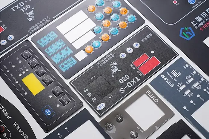
Graphic Overlay vs. Faceplate: A graphic overlay is usually a thin printed film: polycarbonate, polyester, sometimes acrylic. Adhered to a rigid backing or directly to the enclosure. A faceplate might be the thicker, structural layer housing LEDs or membrane switches. Confuse the two and you may over-engineer (read: overspend).
Membrane Switch Overlay: Think of your microwave keypad. Printed circuit traces sit under a tactile dome, all buried under a graphic layer. Press, circuit closes, coffee reheats.
HMI Overlay: In larger control panels, this refers to the whole user interface skin, sometimes married to a touchscreen.
Keypad, Legend Plate, Nameplate: These sub-species pop up everywhere. Keypads offer mechanical or capacitive feedback; legend plates are rigid engraved tags; nameplates carry model numbers or serial numbers.
Why the fuss? Clarity. When someone on your team says, “Order an overlay,” you’ll both picture the same thing and avoid my peeled-sticker shame.
Practical tips learned the hard way:
Measure twice, ask thrice. Confirm cutout sizes and mounting bosses early. A millimeter off equals extra tooling dollars.
Environment dictation. If chemicals fly or UV beats down, pick materials rated to laugh at those threats.
Serial numbering. Bake variable data into the print file so you’re not scrambling with a Sharpie later. Ugly, yes, I’ve done it.
Frustration moment? I once approved a run without specifying matte vs. gloss. The plant lights produced disco-ball glare on every Start button. Customers taped paper over them. Embarrassing. Don’t repeat that.
User Experience & Ergonomics in Interface Graphics
UX isn’t just an app-developer buzzword; it’s the difference between “Push green, machine go” and “Wait, which green?” I learned this standing beside an operator who kept double-tapping a Start pad because the tactile snap felt mushy. We redesigned, and downtime dropped.
Readability First: Contrast ratios matter. The WCAG 2.1 guidelines suggest at least 4.5:1 for small text, and I shoot for 7:1. Navy on light gray beats pale yellow on white any day. Iconography should lean on ISO symbols where possible; folks don’t read manuals mid-panic.
Tactile vs. Capacitive: Tactile domes give that satisfying “click.” Capacitive looks sleek, but can betray gloved hands. I once shipped medical pumps to cold-storage labs, capacitive overlays froze fingers and patience. Lesson: Know your users’ gloves.
Color-Blind–Friendly Palettes: One in twelve men struggles with red-green differentiation. Swap red Stop for bold stop-sign red plus a square icon; use circular green Go. Shapes back up hues.
Layout Zoning: Keep critical controls up top or near the dominant hand. Follow left-to-right process flow; chunk groups (power, motion, diagnostics) with thin divider lines. It’s like arranging a classroom; kids concentrate better when math isn’t next to recess posters.
Practical, teacher-style checklist:
Fonts: Simple sans-serif, minimum 5 mm cap height.
Spacing: Leave at least 1 mm margin around every legend to prevent “label salad.”
Feedback: Back-lighting or indicator LEDs near the action point, not miles away.
And yes, moments of triumph happen: after swapping to glove-rated embossed keys, we measured a 20 % drop in input errors. That’s a stat you brag about at Friday pizza.
Materials & Printing Technologies
Materials make or break longevity. I once cheaped out on PVC overlays for a dairy plant; milk acids chewed them like bubble gum within weeks. Never again.
Polycarbonate (Lexan): Tough, optically clear, easy to silk-screen. Good down to −40 °C. Scratches more easily than polyester but can be hard-coated.
Polyester (Mylar): High chemical and abrasion resistance; better for membrane switches. Slightly pricier but worth it for harsh zones.
Acrylic: Rare for overlays, but great for thick, rigid faceplates requiring laser edge polish.
Printing tech wild ride:
Screen Printing: Best for opaque colors, Pantone accuracy, UV-stable inks. Set-up costs bite on small runs.
Digital UV Printing: Rapid prototyping dream. Full-color gradients, variable data, skip the screener’s solvent smell.
Dead-Front Graphics: Black overlay appears blank until back-lit, looks like James Bond on stereo gear; needs UV-curable inks plus precise opacity layers.
Domed Labels: Polyurethane clear domes add 3-D pop, protect from scuffs, and, weirdly, people love poking them.
Adhesives matter too: opt for 3M 467MP or 468MP for metal, 9472LE for powder-coat. Vent paths prevent air bubbles. Ever see a blister form under a heater control? Yeah, not cute.
Quick lab wisdom: do a “MEK rub test.” Ten double-cotton-swab strokes with methyl ethyl ketone. If ink fades, pick new ink or face warranty claims.
Safety, Compliance & Regulatory Markings
Reg bodies can feel like alphabet soup, but skipping them costs time and cash. Picture me explaining to a UL inspector why our labels fell off in his test chamber.
UL 969 / CSA C22.2 No.0.15: These standards specify adhesion and legibility after 600 hours at 150 °F or chemical splash. Without that mark, North American buyers may reject your product.
IEC 60601-1 (medical): Requires labeling of functional earth, type BF applied parts, etc. Colors: yellow triangles, black text.
OSHA & ANSI Z535: Safety colors, signal red for stop, OSHA green for safe, yellow for caution. Ignore at your peril; fines stack fast.
RoHS & REACH: Material declarations showing overlays free from nasty lead or DEHP. Even adhesives must comply.
Pro-tip sequence:
Ask your overlay vendor for certificates of compliance (CoCs) upfront.
Build a spec sheet referencing UL file numbers. No spec, no accountability.
Keep digital photos of every installed overlay for traceability.
I once forgot to include a flame rating in an RFQ, got glossy samples back, and discovered too late that they didn’t meet the V-0 requirement. Re-tooling stung both wallet and pride.
Branding & Visual Identity Alignment
Here’s the tricky part: balancing brand swagger with operational clarity. Think sports car dash, sleek yet instantly legible.
First, pull up the corporate style guide: Pantone, logo clear-space, taglines. Then ask, “Which elements actually help users?” I had a client demand a 50 mm logo on a 60 mm keypad. We downsized, used a subtle watermark background, and everyone lived.
Textures & Finishes: Brushed-steel print on polycarbonate looks luxe while staying fingerprint-friendly. Matte hard-coat reduces glare; selective gloss highlights a brand mark.
Translucency & Lighting: When an LED back-lights a colored logo at power-on, users get that Apple-boot-chime dopamine. Just ensure diffuser layers prevent hot-spots.
Success Metric: Survey users; if they identify functions faster while still noting brand, you nailed it. A/B tests with prototype overlays can prove ROI.
Tiny Anecdote: I once snuck easter-egg microtext of the company slogan into a texture pattern. Operators spotted it, snapped pics, shared on LinkedIn, and it became free marketing gold.
The Design-to-Production Workflow
Skimp here, and chaos reigns later. My first multi-language panel? I translated “purge” to “puree” on the French layer machines aren’t blenders, folks.
1. Discovery Phase
Interview operators: pain points, glove types, and lighting.
Environment mapping: humidity, chemicals, UV.
Hazard-op (haz-ops) analysis: What happens if the label fails?
2. Rapid Prototyping
Laser-cut blanks + digital UV prints.
Virtual digital twins to test finger reach zones.
In-house “coffee spill” and UV-lamp torture tests.
3. Engineering Drawings
Call out radii ≥1.0 mm to avoid tearing.
Note stack-up thickness for gasket compression math.
Include PMS colors and layer order.
4. Pilot Run & Feedback
10–50 units run through real shifts.
Record peel strength, readability, and operator gripes.
Adjust artwork, adhesive, or tactile dome force.
5. Production & QC
Document every lot.
Spot-check color delta E <2.0.
Maintain spare overlays for field replacements.
Remember to celebrate wins: when our pilot proved 40 % faster button recognition, we bought donuts for the shop. Sugar fuels morale.
Digital, IoT & Augmented Interfaces
Smart overlays used to feel sci-fi; now they’re Tuesday. My first NFC-enabled faceplate blew a customer’s mind. You tap your phone, boom, the manual opens.
Touchscreens Under Protective Overlays: Bond a 0.2 mm PET layer above a capacitive panel to guard against solvents. Keep the total stack under 1.5 mm or touch sensitivity tanks.
NFC & QR Codes: Embed tags under the film for maintenance logs. No more rummaging for PDFs.
RGB Back-Lighting & E-Ink Segments: Overlay icons that shift color based on machine state. Fewer LEDs, more context.
Cyber-Security: Sounds odd for plastic films, but malicious actors can clone NFC tags. Use encoded, dynamic keys and anti-tamper slits in the overlay.
Fun tangent: I hid a Pokémon Easter egg behind a dead-front layer that only appears under UV flashlight. Operators voted it “coolest surprise.” Sometimes fun sells.
Potential frustrations: debugging capacitive ghost touches when humidity rises. A copper mesh shield plus firmware smoothing fixed it, but I lost sleep.
Common Pitfalls & How to Dodge Them
Grab a coffee, this is the hall of shame I reluctantly walk you through.
Over-complicating Icon Sets: Six flavors of arrow confuses everyone. Stick to one arrow, rotate it. Simple.
Ignoring Adhesive Stack-Up: Every micron counts under gasket clamps. Measure, don’t eyeball.
Forgetting Sunlight & Solvents: A gorgeous gloss overlay turns mirror-like outdoors; cherry-picker operators hate that. Test in situ.
Skipping Revision Control: I’ve seen “rev-unknown” overlays still on shelves. Always stamp rev and date small in a corner.
Last-Minute Localization: Text expansion blows up layouts. Plan space for German eight-syllable nouns.
When mistakes happen (and they will), own them. I shipped a batch with the Stop icon upside-down, fixed it for free, and gained trust. Triumph emerges from transparency.
Future Trends (2025-2030)
Buckle up, crystal-ball time.
Printed Conductive Traces: Silver nanoparticle inks drop wiring harness weight by 30 %. Aerospace folks are already prototyping.
Bio-Based Films: Corn-derived polyesters promising 95 % of Mylar’s strength, compostable within a decade.
Shape-Memory Surfaces: Zones that puff up to form a raised button, then flatten when inactive, seen demos, blew my mind.
AI-Driven Adaptive Labeling: Cameras detect user language from the badge, switch overlay text via micro-e-ink. Science fiction? Maybe five-year fiction.
Circular Economy: Removable overlays for refurb cycles. Imagine swapping a faded faceplate without recertifying the whole unit, save cash, save planet.
Keep an eye on partnerships between material giants and electronics start-ups; that’s where the magic brews.
Choosing a Vendor or Going DIY
DIY can be tempting. I’ve run late-night prints on a benchtop UV plotter myself, but know the trade-offs.
When to DIY:
Runs under 20 units, low risk, needs overnight turnaround.
You have in-house design talent and don’t mind zebra-striping from cheap printers.
When to Vendor-Up:
Medical, aerospace, or food-grade compliance needed.
Complex die-cuts, selective textures, or metal domes.
Volume over 100 pieces, economies of scale kick in.
RFQ cheat-sheet questions:
Show me your UL 969 file number.
What adhesive brands do you stock?
Can you color-match to delta E <2?
Do you retain digital print files for five years?
Total cost of ownership includes hidden fail costs, field swaps, brand dings, and operator anger. Buy once, cry less.
Conclusion
Control panel overlays might look like humble stickers, but they steer million-dollar equipment and protect human lives. Dial in materials, nail UX, obey regs, flex your brand, and future-proof with smart tech; all pieces fit together like gears in a gearbox.
Now it’s your turn: sketch that next overlay, quiz your vendor with the cheat-sheet, or hack together a prototype on your garage printer. Whatever path you choose, share your wins (and hilarious fails) in the comments so we can all learn faster, and keep those machines humming safely.