
Bilingual Safety Labels that Don’t Reprint: EN/FR Done Right
Introduction
“One bad label can shut a line down.” I’ve seen it more than once, and the cost surprised everyone. A mislabeled chemical container or a peeling equipment nameplate can spark audits, slow production, and erode trust fast.
Bilingual safety labels matter because Canadian workplaces depend on clear English/French communication, durable materials, and predictable processes. They protect people, reduce risk, and keep operations steady. When labels are compliant, legible, and tough, you avoid reprints and all the chaos that comes with them.
In this guide, I’ll break down the EN/FR rules, common mistakes, and the no-reprint workflow that works under real plant conditions. We’ll talk WHMIS/GHS, Quebec French expectations, UL 969/CSA durability, adhesives for tricky surfaces, and proofing steps that actually catch errors. Let’s make labels you install once and then don’t think about again!
The Compliance Landscape in Canada (EN/FR Essentials)
Canada expects clarity in both official languages for safety and hazard communication, and that’s the starting point for bilingual safety labels. WHMIS aligns with GHS and sets required elements for hazardous product labels. The core pieces include the product identifier, hazard and precautionary statements, signal word, supplier information, and the right pictograms.
For many organizations, bilingual safety labels are not just a best practice; they’re the default to ensure every worker understands the risk. This reduces training gaps and makes audits simpler. It also keeps multi-site operations consistent across provinces.
Quebec adds an extra layer because French needs to be given clear priority on public-facing communications. Many companies choose to make French prominent on equipment and safety decals used in Quebec. The practical approach is to use equal prominence or slightly prioritize French where the audience demands it.
Standards like ANSI Z535 and ISO 7010/ISO 3864 help bring consistency to signal colors, safety headers, and symbols. These aren’t Canadian laws in themselves, but they are proven frameworks that safety teams rely on. They make your system predictable and easier to review.
Electrical nameplates, machinery guards, and confined space signage often involve sector-specific expectations. A nameplate may need performance markings that stay readable after heat, chemicals, and abrasion. That’s why a one-size-fits-all approach rarely works.
An engineer once told me their teams struggled because French text always ran long and wrapped over icons. They thought it was a translation issue, but it was a layout problem and a lack of planning for text expansion. Once they used flexible containers and parallel structures, approvals sped up.
The safest mindset is to map the label types to the regulatory drivers: chemical containers to WHMIS/GHS, machine warnings to ISO/ANSI conventions, and equipment nameplates to your durability specification. Then specify language rules for each family so no one debates it during a rush job.
When you standardize these expectations in a single policy and template library, plants stop improvising. You’ll see fewer late edits and less confusion about what “compliant” means. That alone cuts reprint rates.
Finally, keep a short register of the standards and codes you follow. Include WHMIS/GHS elements, how you apply ISO/ANSI symbols, and when you lean on UL 969/CSA-tested constructions. It becomes your quick reference for audits and supplier onboarding.
The point is simple: define the EN/FR labeling rules once, make them visible, and reuse them everywhere. That consistency is half the battle in avoiding reprints.
Why Labels Get Reprinted (Root Causes to Eliminate)
Most reprints don’t come from fancy edge cases. They come from the same five causes over and over again. Language errors, drifting requirements, layout failures, wrong materials, and messy processes drive nearly every do-over I’ve seen.
Language errors show up as mistranslations, missing diacritics, or inconsistent terminology across lines. French tends to be longer than English, so copy that fits in EN may crash into icons in FR. That’s not a translator problem; it’s a container and hierarchy problem.
Requirements drift when teams update SOPs or a hazard classification changes, but artwork doesn’t. An H-statement tweaks by one word and the old version keeps being printed. By the time someone notices, a batch is on pallets and the line is booked.
Layout failures usually appear as tiny symbols, crowded headers, and unclear hierarchy. Workers need danger/warning/caution headers that read quickly, with symbols that are visible from the viewing distance. If the icon is too small or the contrast is weak, the label fails at the exact moment it’s needed.
Material mismatch causes peeling labels, faded ink, and smudged data. An adhesive that holds well on smooth stainless may fail on powder coat or LSE plastics like polypropylene. If the laminate can’t handle solvents, a single wipe with IPA tells the truth.
Process gaps are the sneakiest. No master data, version chaos, and last-minute edits at the press or on the plant floor turn good art into bad stickers. Someone types a serial range directly in the file, and there goes traceability.
A maintenance supervisor told me they reprinted a set three times in one week. The problem wasn’t the printer. It was different spreadsheets feeding different label versions. When they moved to a master data source and locked variables, reprints dropped to near zero.
Another team thought they needed heavier adhesive because labels were lifting on textured housings. The real fix was surface prep and proper pressure during application. They added a roller and a 15-second hold. The “adhesive problem” disappeared overnight.
You can cut reprints by attacking these causes with checklists and templates. Build bilingual copy you trust, templates that allow text expansion, and materials specified for the real substrate. Tie it together with version control so people can’t improvise at the eleventh hour.
Once you track the reprint reasons, patterns emerge. You’ll see the same three errors every quarter. Solve those upstream, and the rest gets quiet. That’s the no-drama labeling program you want.
EN/FR Copy & Translation Done Right
Great bilingual safety labels start with language, not graphics. The copy must be accurate, plain, and consistent between English and French. That means building a bilingual glossary and using translation memory for hazard and precautionary statements. It’s faster and safer than starting from scratch each time.
Keep sentence structures parallel so workers can scan either language quickly. If the English uses clear imperatives, the French should do the same. It sounds minor, but it shapes how people read instructions under stress.
Plan for text expansion in French. A simple rule of thumb is to assume 15–25% more space. Templates that flex with containers and line breaks will save endless headaches. I’ve watched a team cram French into 8-point type just to make it fit. It technically “fit,” but it failed the legibility test the first week.
Avoid relying on auto-translation for safety-critical phrases. Use a qualified translator or an internal bilingual SME who knows WHMIS/GHS phrasing. Pictograms carry meaning, but text still does the heavy lifting in many workplaces.
Build a mini style guide for labels. Decide on punctuation, capitalization, number formats, units, and date conventions in both languages. When those details are steady, the labels feel professional and trustworthy.
A small anecdote: a plant manager told me workers ignored a specific caution label because it looked different from everything else. The French ran in a smaller font, and the punctuation changed mid-shift after a quick edit. Standardizing those elements brought the trust back. It was a subtle fix with a big effect.
Create a review loop that includes a bilingual SME, safety, and the equipment owner. Use redlines to focus comments and lock the final. I prefer a short checklist: header accuracy, pictogram match, hazard statement conformity, supplier info, and variable data zones.
Consider a “symbol-first” pattern where appropriate. Leading with the ISO/ANSI pictogram can speed recognition, followed by short EN/FR lines. It won’t replace the need for full statements on WHMIS labels, but it helps for quick warnings and equipment decals.
Store all approved phrases in a searchable repository, tied to label families. People should pull from the same source every time. If a phrase changes, a single update cascades through your templates. That prevents the old language from reappearing a year later.
Finally, treat language as a controlled asset. It’s not an art project that gets reinvented for each label. When copy is consistent, approvals are faster, and reprints fall away.
Design Standards that Prevent Reprints
Design is where labels either become easy to use or easy to ignore. Start with signal colors and headers that follow proven standards like ANSI Z535 and ISO 3864. A strong DANGER/WARNING/CAUTION hierarchy is familiar on the floor and reduces hesitation when seconds matter.
Use ISO 7010 pictograms where they fit the hazard. People recognize them at a glance. Pair them with the right header and concise EN/FR text so meaning is obvious from a distance. This layered approach improves comprehension.
Legibility depends on type size, x-height, and contrast. Calculate viewing distance and size the text and symbols accordingly. If operators read labels from 1.5 meters, design for that distance with room to spare. Better to be a bit bigger than technically minimal.
French expansion is a design constraint, not a surprise. Use containers that accept longer lines gracefully. Avoid locking icon and text boxes so tightly that any change triggers an emergency redesign. Flexible grids make bilingual work calm.
Keep information architecture consistent across label families. I like hazard → consequence → avoidance → required PPE. When every label follows the same flow, training sticks and searches go faster. Workers learn where to look first.
Watch out for variable data collisions. Serial numbers, dates, and lot codes can collide with the fixed EN/FR text if the merge fields aren’t boxed thoughtfully. Reserve zones for variable data and test with the longest realistic strings.
Anecdote: an OEM added a QR code linking to a digital manual. Smart idea, poor placement. The code overlapped the French line break in two sizes. Field techs couldn’t scan it, and the plant reprinted the whole run. A simple move to a dedicated corner solved it.
Contrast matters more than brand color on safety labels. Keep backgrounds clean and avoid placing small text on patterned surfaces. If a brand palette fights legibility, let the safety palette win. It’s the right fight to lose.
Build a “do-not-change” layer in your artwork with bleed, safe areas, and dielines. Lock it down. People can adjust copy and variable fields, but they shouldn’t touch the structural lines. That’s how you stop last-minute shifts that cut off text.
Finally, pilot the design in the real environment. Print a few, stick them on the actual substrate, and observe from the real distance and lighting. Field trials beat screen proofs every time, and they keep the reprint truck from arriving.
Materials, Adhesives & Durability (UL 969/CSA-Ready)
Durability is where many bilingual safety labels fail after installation. The message can be perfect, but if the label peels, fades, or smears, you’re reprinting anyway. This is where UL 969 style constructions and CSA-ready thinking save the day.
Choose substrates based on the environment. Polyester films handle heat and chemicals well and stay dimensionally stable. Vinyl can flex on curved or textured surfaces and is forgiving on installs. Polycarbonate excels as an overlay for control panels where abrasion is frequent.
Match adhesives to the substrate. Low surface energy plastics like PP or PE need LSE-rated adhesives. Powder coat and textured housings demand thicker, more conformable adhesives. Oily metals may require aggressive tack plus proper surface prep.
Protect the print with the right overlaminate or overprint varnish. If the area sees solvents, choose laminates tested against IPA, acetone, and cleaning agents. UV exposure calls for UV-resistant inks and films that won’t yellow. Washdown areas need moisture and edge sealing strategies.
A maintenance lead shared that their labels lifted near steam lines every winter. The fix wasn’t a “stronger” glue; it was thermal cycling and edge exposure. A slightly thicker film, rounded corners, and edge-sealing pushed durability past two winters without a single lift.
Nameplates may require metalized films or aluminum if temperatures swing high and abrasion is constant. Combine that with a permanent adhesive rated for the operating range. Don’t guess the range. Measure it or get the real numbers from engineering.
Run basic environmental checks before you commit to a construction. Try a solvent wipe test with the chemicals techs actually use. Do a quick temperature cycle in a lab oven or even a controlled room test. Light salt spray exposure can reveal weak edges.
UL 969-style tested combinations are useful because they’re proven to stay legible and adhered. If your supplier offers pre-qualified systems, you skip months of trial. For CSA nameplates, confirm readability requirements and the expected lifetime of the equipment.
Keep a materials matrix in your spec. List the substrate, the adhesive family, the laminate type, and the approved printer/ink. When people choose from that matrix, they’re choosing durability. That’s how you stop “mystery” failures.
In the field, durability is a chain. If any link, film, adhesive, ink, or laminate doesn’t fit the environment, the whole label fails. Build the chain for the real conditions, and reprints stop showing up on work orders.
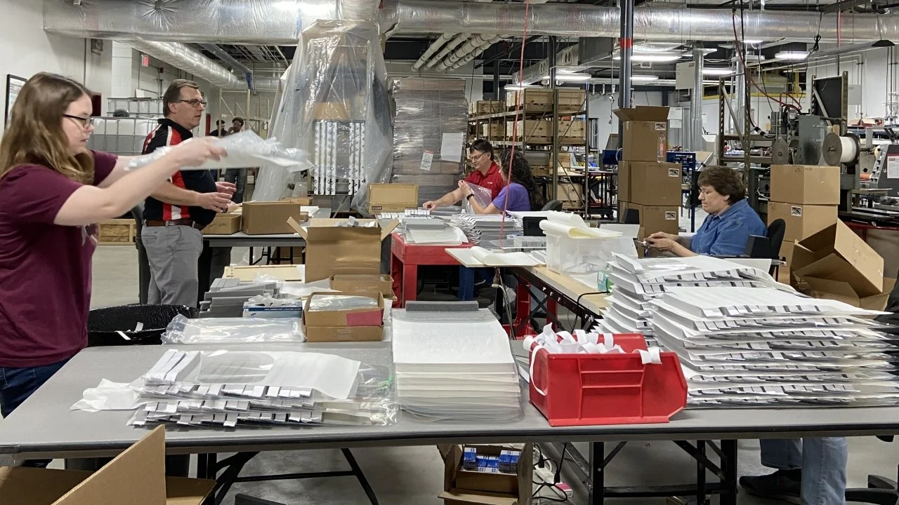
Print, Application & Field Realities
Even the best design and materials won’t survive poor printing and sloppy application. Choose the print method that matches your run sizes and durability needs. Digital is fast for short bilingual sets and frequent changes. Flexo shines for large volumes where consistency rules. Thermal transfer is reliable for variable data in harsh environments.
A supplier once told me their thermal transfer ribbon looked fine on day one but smeared after a month. The ribbon wasn’t matched to the film and the environment. They switched to a resin ribbon rated for chemicals, and the smearing stopped for good.
Application is its own process. Clean the surface, remove oils and dust, and let solvents evaporate fully. Apply with firm, even pressure and hold for a few seconds to wet out the adhesive. On colder days, pre-warm the surface within the adhesive’s recommended range.
Textured or riveted surfaces need technique. Use a roller to push adhesive into micro-textures. Bridge over rivets with care or use a slit to relieve tension if the spec allows it. A simple edge sealant can extend life in high-wash zones.
Avoid on-site edits to approved labels. If a number changes, generate a new variable data run from the master. The minute people type on the label in the field, version control is gone. That’s where traceability breaks and reprints rise.
Do quick field audits after the first install. Photograph labels at the real viewing distance. Check for edge lift, bubbles, or early scuffs. Note which surfaces gave trouble and update the application SOP so the next shift doesn’t repeat the same mistake.
Train installers with a small toolkit: surface cleaner, lint-free wipes, a roller or squeegee, edge sealant if specified, and a short checklist. When people have the right tools in their pocket, quality becomes normal.
Printer maintenance matters. Replace worn printheads, calibrate registration, and keep dust out of the path. Many “design problems” are really print defects that vary by shift. Consistent press conditions make consistent labels.
One last detail: test the scannability of barcodes and QR codes on the actual surface under plant lighting. A code that scans at the desk might fail over textured housing. Field tests save embarrassment and avoid emergency reprints.
Print, apply, and verify as a single chain. If you do, reprints become rare because the process is steady from art to equipment.
The “No-Reprint” Workflow (Governance & QA)
A no-reprint program is mostly governance with a bit of discipline. Start with a single source of truth for copy, symbols, and templates. Tie it to your PIM/PLM or document control so changes are tracked and visible. People should pull assets, not recreate them.
Version control is non-negotiable. Every label family gets an ID, a revision, and an owner. Approvals are recorded with dates and names. If someone asks, “Which version is on Line 2?”, the answer should be a click away.
Preflight checks catch 80% of errors. Confirm language accuracy, symbol set, dielines, bleed and safe areas, variable data zones, and contrast. Run a short test print and have a second person sign off. Two sets of eyes beat any spellchecker.
Golden samples help installers and auditors know what “good” looks like. Store a printed master with a QR code that links to the current spec and artwork. If there’s doubt on the floor, people scan and verify. No debates, no reprints.
A quality manager told me they added a five-minute “label gate” to their work orders. If a label was touched, someone checked the version, language, and material before release. Reprints dropped by half in the first quarter, and no one felt overburdened.
Schedule maintenance reviews quarterly for regulatory language and annually for materials. If WHMIS phrasing updates or a new cleaner is introduced, you’ll catch it early. Don’t wait for a failed audit to discover drift.
Document deviations. If a plant uses a different adhesive for a specific surface, record it and test it. If it works, add it to the matrix. If it fails, close the loop so it doesn’t sneak back in six months later.
Supplier management is part of governance. Ask for change notifications on films, adhesives, and inks. A quiet formulation change can alter adhesion or print density. Good suppliers will signal those changes in time for you to test.
Keep the workflow short and repeatable. Intake → design using approved assets → preflight → pilot print → golden sample → release with version control. When people trust the system, they follow it. When it’s a maze, they won’t.
Governance sounds dull. It is, and that’s the point. Boring workflows make exciting emergencies disappear.
Cost of Reprints & the ROI of Doing It Right
Reprints cost more than paper and ink. They burn time, interrupt production, and invite risk. When you model the true cost, the ROI of a no-reprint program becomes obvious. It’s one of the rare safety initiatives that pays for itself.
Start with direct costs: materials, printer time, and labor. Add the time to remove bad labels, clean surfaces, and install new ones. If production pauses, include that downtime cost. Even a short stop can ripple through a shift.
Include quality and risk costs. A mislabeled hazardous product increases incident likelihood and audit findings. Warranty claims and customer complaints follow weak nameplates and unreadable warnings. Those costs are real and visible during reviews.
A facilities team I worked with tracked reprints for one quarter. The number looked small until they added the downtime minutes. The hidden cost doubled the total. After switching to a certified construction and a locked template, they cut reprints by 70% and the savings covered the change in one quarter.
Reduce reprints by consolidating SKUs. Clever bilingual layouts with flexible fields can serve multiple product variants. Fewer SKUs mean fewer chances to pick the wrong file. It also simplifies inventories and training.
Track KPIs that show progress. Reprint rate by line, number of nonconformances, field failures, and audit findings tell a clear story. When those graphs slope down, leadership notices and keeps supporting the program.
Build a simple business case template. Show current reprint cost, projected reduction, the price of upgraded materials, and the workflow setup time. Most teams find the payback occurs within a few months if reprints are frequent.
Celebrate quick wins. When a high-visibility line runs a month with zero label issues, share it. People respond to evidence more than memos. Momentum makes the rest of the rollout smoother.
If budgets are tight, pilot on the worst offender first. One line, one label family, one surface. Prove it, bank the savings, and reinvest in the next wave. That’s how you scale without drama.
ROI here is practical, not theoretical. Do the math once, and you’ll have the support to keep the program strong and rare reprints.
Implementation Plan & Checklist (Download-Ready)
A clean implementation plan gives everyone confidence. Use a 30–60–90 day approach so teams see progress and the work stays manageable. Start with an audit, set standards, pilot a family, then scale.
In the first 30 days, audit label families, materials, and workflows. Identify the worst reprint causes and the high-risk surfaces. Build or refine your bilingual glossary and approve core WHMIS/GHS phrases. Pick a pilot family and document the current state.
In the next 30 days, finalize templates with flexible containers and parallel EN/FR structure. Specify materials and adhesives for real substrates. Set up version control and a simple preflight checklist. Print and test golden samples in the field.
In the final 30 days, train installers, approve the pilot, and roll out to one additional family. Record results, update SOPs, and lock the change control rules. Prepare a short business case summarizing savings and issues solved.
Define a RACI so roles are clear. EHS owns WHMIS/GHS language, Engineering owns surfaces and operating ranges, Quality owns preflight and approval gates, Operations owns application SOPs, and Suppliers own material specs and change notices.
Qualify suppliers with a few focused questions. Ask for their tested material constructions, adhesive families for LSE and powder coat, and lead times on change notifications. Reliability beats the lowest unit price every time.
Keep a printable checklist for each label release. Confirm header and symbol accuracy, EN/FR copy, diacritics, viewing distance legibility, variable data zones, dielines and safe areas, materials, adhesive, laminate, and version control. Check the box, sign, and archive it.
Anecdote from a rollout: a team laminated the checklist to clipboards and used dry-erase markers. It sounds simple, but it nudged people to slow down and verify. Their reprint numbers dropped visibly within two sprints.
Plan a quarterly review to revisit the glossary, templates, and material performance. If a new solvent shows up on the plant floor, test labels against it. If a new substrate appears, add the right adhesive to the matrix.
Implementation succeeds when people can follow it easily. Small, clear steps beat grand strategies that live in binders. Make it practical, and the results follow.
Conclusion
Bilingual safety labels protect people and keep lines moving, but only when the language, design, materials, and workflow come together. When EN/FR copy is consistent, the design follows proven standards, and the construction survives the real environment, reprints just fade away. That’s safer for teams and simpler for budgets.
Use the steps here to audit one label family this month. Build your glossary, lock a flexible template, specify a proven construction, and run a small field pilot. Adjust, record, and roll forward. It’s steady work, not flashy, but it pays off quickly.
Remember the basics: clear hazard communication, legible type, durable materials, and strict version control. Respect the safety intent, and let the process stay boring. That’s the quiet success of a no-reprint program.
I’d love to hear what’s worked in your plant, too. Share your best tips or your toughest surfaces, and let’s help more teams get EN/FR labels done right the first time.